BMW Roundel: Not Born From Planes
For decades, the spin on BMW’s signature roundel — the automaker’s logo, which looks like a propeller blade set against a blue sky — was that it represented a propeller blade set against a blue sky. The design was supposedly a tribute to the roots of Bayerische Motoren Werke (or Bavarian Motor Works in English) in the early 20th century, when the company built aircraft engines.
Well, think again.
In last Sunday’s Automobiles section, I wrote about visiting a quartet of German car museums. At the BMW Museum in Munich, my affable tour guide, Anne Schmidt-Possiwal, explained that the blue-and-white company logo did not represent a spinning propeller, but was meant to show the colors of the Free State of Bavaria.
I was surprised. My editor was surprised and skeptical (editors are paid to be skeptical). He reached out to BMW North America for clarification. We received a note from Dave Buchko, a company spokesman, who said “the shape and configuration of the roundel was meant to replicate a spinning propeller against a blue sky background.”
But earlier this week, Mr. Buchko generously allowed in an e-mail message that Ms. Schmidt-Possiwal had been right. Tom Plucinsky, another BMW spokesman, said in a telephone interview that the company once thought the logo was based on a propeller.
“In fact, I have an old history book here that says it is,” he said. “But this all changed in the past year, with the clarification that the roundel was used in an advertisement next to an airplane. We felt that we had to go back and correct this. Brand studies have shown that the roundel over the years has become one of the most recognizable logos, right up there with the Coke bottle.”
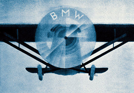
According to a history published on the BMW enthusiast site 318ti.org, the trademark was registered in 1917, and it featured the letters BMW “at the top of the outer ring. The inner featured quadrants in the Bavarian Free State colors of blue and white - but in the opposed order - because it was illegal to use national symbols in a commercial trademark.
“The design was not in any way connected with aircraft engines or propellers. The idea that the blue and white had anything to do with spinning propellers comes from a 1929 advertisement, which featured aircraft with the image of the roundel in the rotating propellers.”
So, apparently, that’s that. If you care to make a friendly wager about the topic, feel free to quote Ms. Schmidt-Possiwal and Mr. Plucinsky.
Except, really, doesn’t that roundel look like a propeller blade set against a blue sky?
BMW Roundel: Not Born From Planes - Wheels Blog - NYTimes.com
The BMW Roundel, one of the world's most recognized and revered commercial symbols,celebrates its 90th anniversary this month.In July 1917 Franz Josef Popp registered thename Bayerische Motoren Werke, thus distancingthe new company from the Rapp Motorenwerke.This was a necessary move if the new companywas to find new clients and prosper. The name wasregistered but as yet there was no new logo…It was on 5 October 1917 that the BMW trademarkwas registered with the Imperial Trade MarkRoll under No. 221388. It featured the circular design of the Rapp logo but with the letters BMWat the top of the outer ring. The inner featuredquadrants in the Bavarian Free State colours ofblue and white - but in the opposed order - as itwas illegal to use national symbols in a commercialtrademark.
The design was not in any way connectedwith aircraft engines or propellers. The idea thatthe blue and white had anything to do with spinningpropellers comes from a 1929 advertisement,which featured aircraft with the image of theRoundel in the rotating propellers. This advertisementcame at the beginning of the GreatDepression, which coincided with BMW acquiringthe license to build Pratt & Whitney radial aircraftengines. The advertising department used theRoundel and BMW heritage in an attempt toBMW Roundel Celebrates 90 YearsA Roundel Myth is Dispelledincrease sales of the new radial motors.The idea of the spinning propellers was givengreater credence in an article by WilhelmFarrenkopf in a BMW journal of 1942. This alsofeatured an image of an aircraft with a spinningRoundel. These were powerful images and thelegend of the spinning propeller was born.The logo was registered on 5 October but itwas in limited use prior to this date. On 1 October1917 Franz Josef Popp was given a certificate confirminghis appointment as General Manager and itwas adorned with the now familiar BMW Roundel.The basic structure of the Roundel hasremained the same over 90 years but there havebeen subtle changes.
In the original design the letteringand outline was in gold, but by the time thefirst BMW motorcycle - the R 32 - was released in1923 it had changed slightly. The letters were stillin gold but the font was bolder and letters closertogether. This was the style that was submitted tothe German Register of Trade Marks in 1933,and the international register of trademarks in1934. This did not however stop various versionsbeing used.One of the early BMW advertisements usingthe logo was in 1918 with the 'Falling Roundels',this was a positioning advertisement that wasdesigned to establish the brand and give anindication to its current and future products.Subsequent advertisements, posters andeven cars and motorcycles also featured manystyles of Roundel.
The proportions changed, theshade of blue used, and the lettering could be ingold, white or silver with serif or sans-serif fonts indifferent sizes. There appears to be no reason forthis variance except for product designers andmarketing and communication staff using personalchoice depending on application.Through the 1950s there was a more concertedeffort to standardize the Roundel. The use ofwhite lettering was now standard and when usedon cars and motorcycles it was silver. By the1960s the serif font was replaced by sans-serif,and this was used on all motorcycles by 1966.There was a subsequent change to a slightlybolder font and this has remained as the standardRoundel. There was flirtation with a 'MotorsportRoundel' in the early 1970s and '80s which had thestandard logo surrounded by the BMW Motorsportcolours. In 1997 BMW moved to having theRoundel depicted in 3-D when used in the printedform. This gives the Roundel a new bolder anddynamic look.The BMW Roundel is now ranked in the topten of the world's most recognized commerciallogos and is an iconic symbol in its own right. Theoriginal design, in its simplicity and symbolismhas stood the test of time.
The BMW Roundel History - 318ti.org forum

