Thankyou for not bashing me. However, I certainly like the counter argument and disagreement on the only 2 things, Out of the three that I mentioned.
Contrasts are first visualized in mind based on the overall aesthetic sense of the product outcome.
Aesthetic sense is very important. Otherwise, even a Ricer can appear different.
Its these small subtle details, what makes you stand out in many.
The simple OEM emblem would have looked better (not just good too). If it had been a white/silver or black chassis, you could have easily pasted that Red Emblem.
Example.
Notice how different and appealing that emblem is looking below.
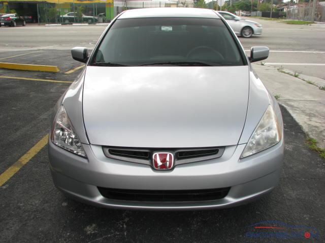
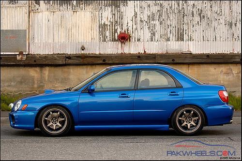
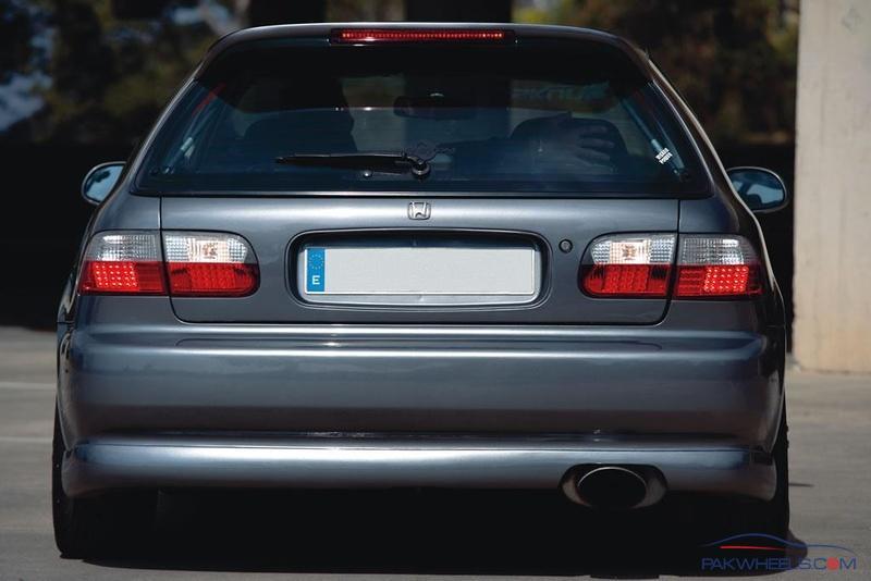
And to do justice, lets just post a pic in a color close to subject. However, even here, there's no other distraction (as in the Parking Pole, the Huge Licence Plate Holder, and the amber signals shown above). The logo standing out on its own.
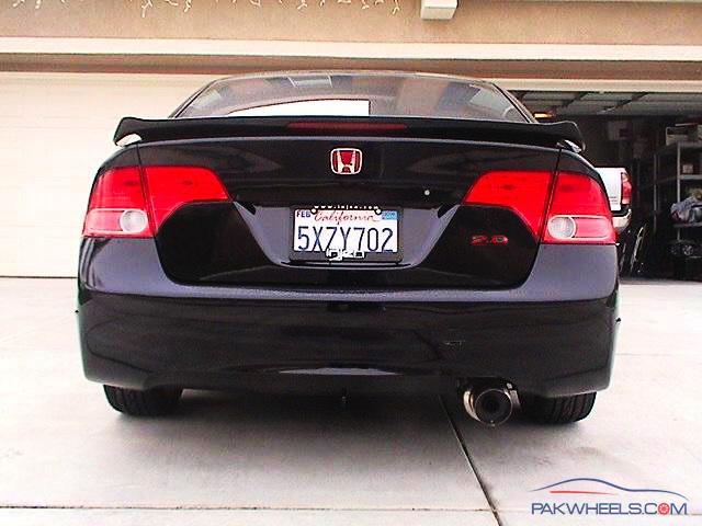
Speaking of Licence Plate Holder, dont you think it would have been more justified on a more neutral colour??
I am curious to know. Why didnt you want bronze?? It would have highlighted the overall stance of the vehicle.
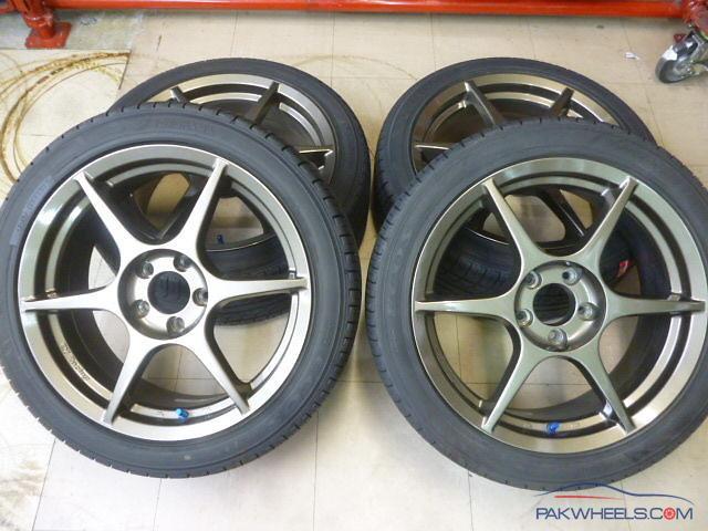
Would have turned something like,
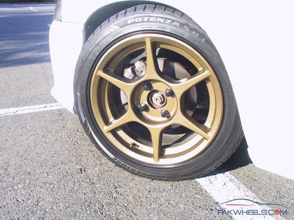
or if somewhat lighter, something like,
By the way, bronze or no-bronze, you do need to drop that blue on the caliper and hubs. Its not helping. Seriously.
My suggestion, black. Please dont go for yellow or bright red calipers/hubs.
White or Silver would have worked just fine if had given it another thought.
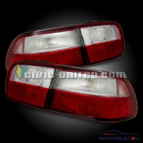
Since we are welcoming criticism, might as well look out for some other options in the tail light. The OE lights are valuable, just not contributing.
Something on the lines:
or may be:
380 Replies in total to the thread. And only about 04 criticizing for a better possible outcome.
Thats not a before-time hard opinion my friend. Thats just difference of opinion.
Hope it helps. Cheers 


